In an era where sports news is changing rapidly, with daily surprises and polemics, as well as remarkable performances, the evolution of the Champions League logo may seem a minor subject. However, despite the exciting sporting events, such as the invincibility of Teddy Riner in judo, the hype around the Lebrun brothers in ping pong, or the many Alaphilippe falls in cycling, considering the change of a logo takes particular importance. Indeed, the visual identity of the Champions League reflects the constant evolution of competition, symbolizing the dynamism and emotions of the sport, from darts to football, encompassing both moments of surprise and disappointments. It is a visual narrative that, in its own way, reflects the ongoing history and development of this iconic competition, illustrating how, like sport in general, it continues to transform, amaze and sometimes create cleavages.
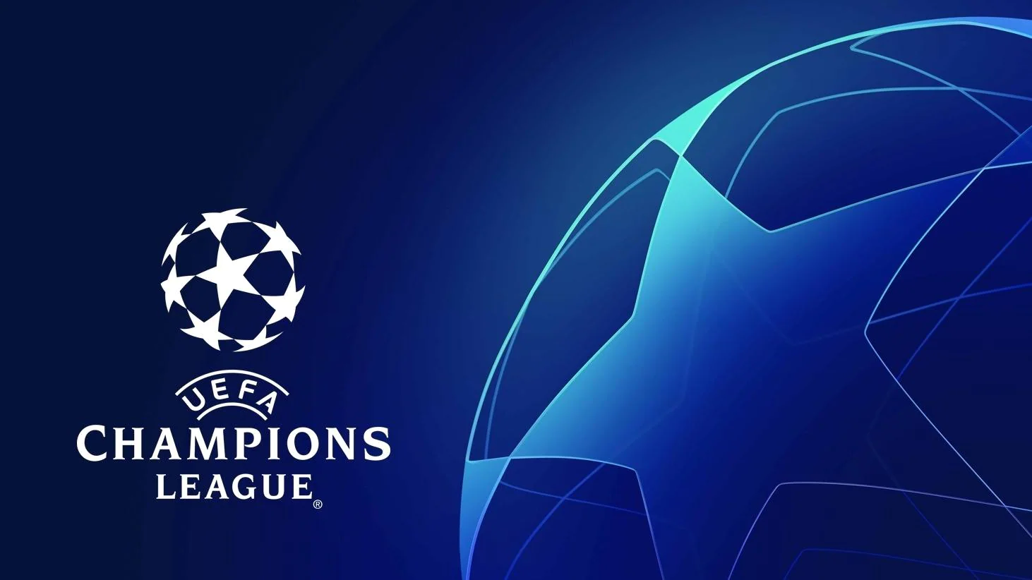
The evolution of the Champions League logo and visual identity
30 April
5 min
The foundations of visual identity
Let’s dive into the fascinating world of visual identity, where each logo aspires to stand out in the fierce competition of the market, seeking to attract the attention of customers to the brand it represents. It is an attractive idea to believe that a logo, like a flag, can significantly influence the success of a marketing campaign.
The first point of interest is the logo itself, designed to be memorable like the summer hits. Although sometimes its impact seems fleeting, the intention is that it serves as a powerful symbol, capturing the essence of the brand after careful reflection. This creative process is crucial, although the end result can sometimes seem too familiar, reminiscent of other logos, including that of a local pizzeria.
Then there is the choice of colors, considered strategic because supposed to evoke certain emotions or values to consumers: blue for confidence, red for passion, green for environmental commitment. However, the effectiveness of these messages can sometimes be questioned, making the color selection process as uncertain as the interpretation of tea leaves.
Typography, often undervalued, is nevertheless a key element of visual identity. It is supposed to communicate directly with the consumer, although the distinction between different types of policies is sometimes subtle for the general public.
The images and shapes used to create the brand’s visual universe are encouraged to be bold and unique. Despite this, the market seems saturated with stereotypical images, limiting creativity to the options available on online image banks.
Finally, the graphic charter, essential to ensure visual consistency, is paradoxically often neglected, to the point of being rarely consulted, a little like the terms and conditions of use of a software.
In conclusion, the visual identity combines psychology, art and marketing in order to create a memorable brand. What really matters is the emotional connection the brand makes with its customers. Creating a logo, choosing colors, and selecting typography are important steps in this process. However, it is also wise to consider other strategies, such as an effective advertising campaign, to ensure that the brand remains engraved in the minds of consumers.
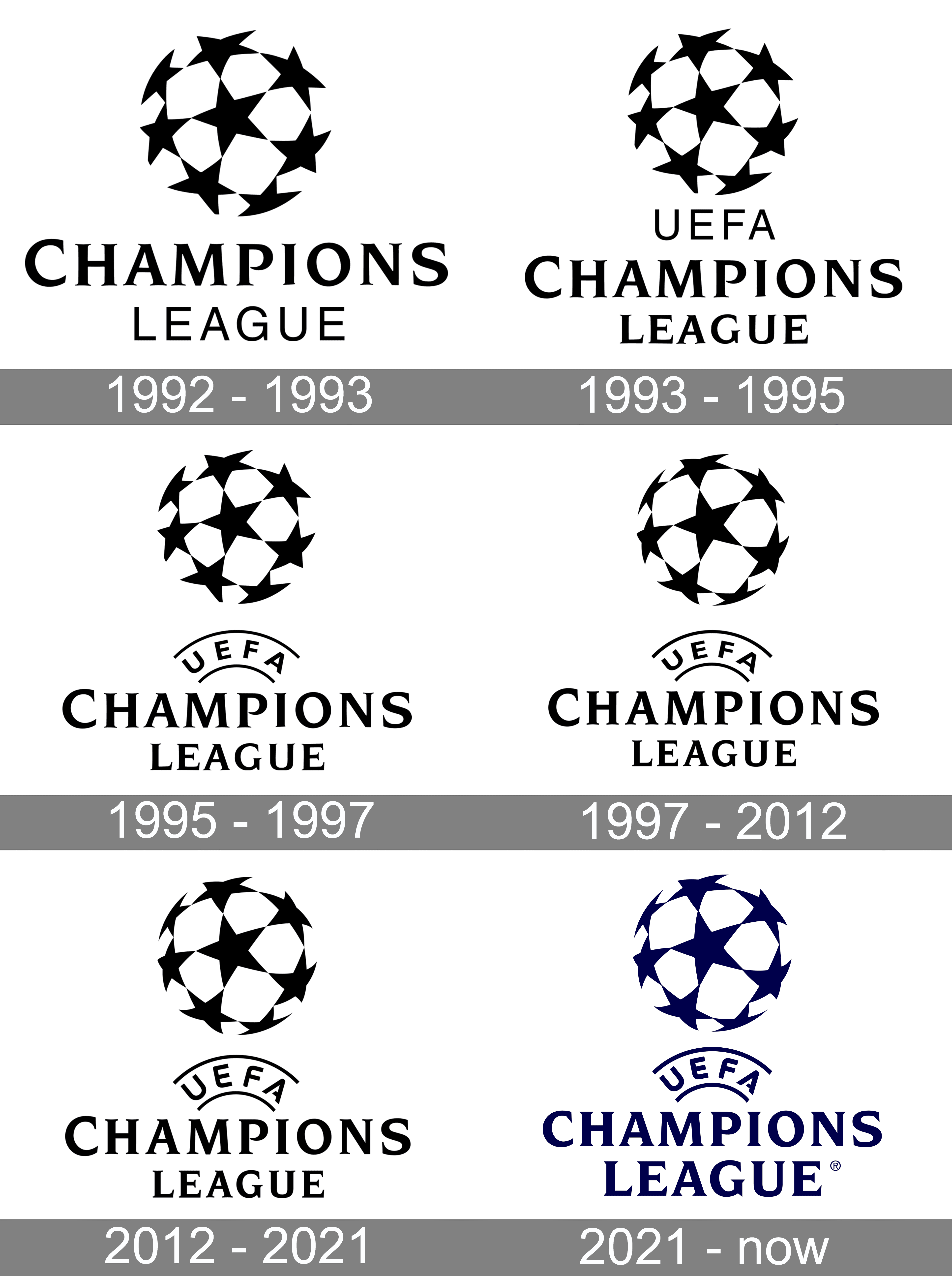
Evolution of the visual identity of the Champions League
The history of the Champions League logo is an evolution as captivating as the history of football itself, marked by significant changes that reflect the evolution of this European competition since 1955. This competition, at the heart of football passions, has also seen its share of visual transformations, lending itself to a game of “makeover” of its logo, with as much enthusiasm as a decisive match.
A look back at key moments: in 1992, with the transition from the European Cup to the UEFA Champions League, a new logo was introduced. Simple and memorable, he sports a starred ball with an assurance that recalls the impact of a well placed penalty. This design marked the beginning of a new visual era for competition.
In 1993, the addition of “UEFA” to the logo brought an institutional dimension, setting the stage for further significant updates. In 1995, the logo evolves again, adopting a right orientation that symbolizes the look towards the future. The arrival of the monochrome version in 1996 brings a modern twist, followed by a major transformation in 2012 to align with UEFA’s new branding.
In 2021, the logo is revisited again, with a bold design and typography that seek to embody modernity. These changes illustrate how the Champions League has adapted and reinvented itself, reflecting football dynamics and design trends.
This logo story is not just about a competition; it embodies a brand and identity that is constantly evolving. Each logo change is a new chapter in the history of European football, showing the skill with which UEFA has managed its brand image.
While the future of the Champions League remains open, a certainty emerges: its visual identity will continue to reinvent itself, thus fueling curiosity and debate. Imagine a future where innovations such as a holographic logo or an official emoji would enrich this competition. In this cross between art and sport, the horizons seem limitless, announcing that the epic logo of the Champions League still has beautiful days ahead.
So you thought navigating the tumultuous world of visual identity was as perilous as dribbling through a concrete defense? Think twice. KT Sport Design comes into play as this unexpected player who scores midfield, with disconcerting ease. They turn the nightmare of creating a visual identity into a party of pleasure, a bit like watching the revenge of Paris against Barcelona. With us, get ready to see your brand stand out in the competitive melee, shining brighter than a neon jersey in a night game. In short, with KT Sport Design, the visual identity becomes less of a chore and more of a celebration, including champagne.
